I ate, I ate some more, made another attempt at skiing, and am completely enthralled by the gorgeous book 'A Map of the World', Sinterklaas gave me.
© Anna Denise Floor

I ate, I ate some more, made another attempt at skiing, and am completely enthralled by the gorgeous book 'A Map of the World', Sinterklaas gave me.
© Anna Denise Floor
This week, I was in London for work and I worked out. Oh, and I stole my husbands idea for a drawing. Happy weekend!
© Anna Denise Floor
© Anna Denise Floor
So quiet (but good quiet!) that I've got my drawing finished for the weekend already. So no one do anything crazy this evening, because it will NOT be recorded, y'all. I repeat: it will NOT be recorded. 0_o
PS: The mushroom book is really quite awesome. I'll post about it soon, as I tried taking pictures of it today, but the crappy lighting shat all over that marvelous idea.
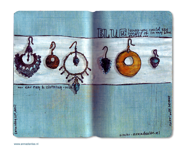
Journal page © Anna Denise Floor
Learning new things really is one of my favorite things in life, but it also means my list of things I suck at is longer than most people's.
Soccer? Disaster. Knitting? Ehm. Humbling? Tennis? A chapter in my life we will not speak of ever again. Walking? An ongoing battle.
But mostly - learning new things is just great fun and good practice of cultivating your 'beginners mind'. Some things I learned this week: I relearned that I actually love skiing and am pretty unafraid (we even did some little jumps!), even though I'm an absolute beginner of course . I also learned that my husband is a great teacher when I allow him to teach me new things (heh. Not that I'm usually stubborn or anything...) and that ski pants don't have to make your butt look unattractive (I know right, this was totally holding me back as well). I found out (again), that I'm apparently quite attached to my old boring hairdo. Ah. Such important life lessons here. Next up: enlightenment. BAM!
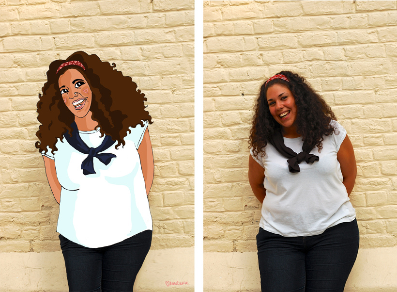
Impression of 'me' wearing 'The Knit Kid', for Oh Marie! © Anna Denise Floor
Oh, oh, oh hold on! Before we go there - I wrote/drew a post for the Oh Marie blog, where I discuss and illustrate my Etsy crushes. It'll be a monthly installment, and first up is my ongoing love for The Knit Kid. Read the post here!
Also, if you've never heard of Oh Marie!, go check it out. It's an amazing (free!) online magazine with tons of gorgeous photography, great articles, and DIY magic. Their last issue (#5) was just published and it's once again stunning. Check it out here.
© Anna Denise Floor
Click on the image for a larger view.
Don't you just luuurrrve the internet? I sure do, and not just because I get to connect with far-away friends and strangers, work and collaborate internationally, and have 24-hour access to information and inspiration (someone say kittehs?). No, actually it's because I get to update everyone on what I eat all day. Heck yes, Instagram, and heck yes, drawing my food. Because I know you care. Deeply.
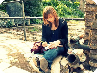
As I explained in my previous post, I got to go to the Amsterdam Film Week (for frizzles!) and draw my movie reviews for VERS magazine. After reviewing 'Argo', I went to see two more movies.
© Anna Denise Floor for VERS
'An Episode in the Life of an Iron Picker' is beautifully filmed, but I found the film somewhat slow paced and the acting a little bland. The movie depicts the life of a Roma family. The mother cooks, cleans, and tends to their two hyperactive kids, while her husband picks up scrap metal from abandoned cars and junkyards. A hard life that gets worse when the wife falls ill and needs an expensive operation to survive. They can't afford the operation and a frantic search for money ensues. Dramatic, to say the least, but the non-professional actors re-enacting bits of their own life, seemed somewhat camera-shy and unable to conjure the emotions they must have felt going through the ordeal the first time.
© Anna Denise Floor for VERS
The third and final movie we got to see was 'The Young and Prodigious T.S. Spivet', by Jean-Pierre Jeunet, who also directed Amélie. Knowing this, I probably was biased before I even went to see this movie, but it did not disappoint. I laughed, I cried, I want to see it again. It's a story about a brilliant young boy, leaving his family to pick up a science award in Washington, DC. It's kind of Amélie meets Moonrise Kingdom. Full of beautiful colors, animations, jokes, and images. A feast for the eye.
I want to thank VERS magazine for this awesome challenge, as well as the Amsterdam Film Week. Yay!
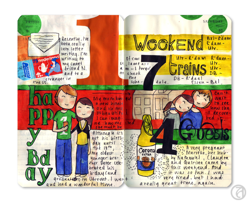
© Anna Denise Floor
Am a bit behind on posting my journal pages as you can see. These past two weeks have been absolutely nuts. I travelled to London and Dublin for work (yes, my life is actually that awesome, hate me), threw a big wedding celebration with the Fantastic Mr. Floor, somehow messed up my big toe, making it ever harder to walk normally, and generally spent a lot of time feeling Very Responsible for Everything (which is a great way to spend your time. Squiggly mouth smiley face).
Anyhow - here's a drawing. Tadah!
Now go away and ignore the fact that it's almost freaking November.
Journal page for the weekend of October 4-6, 2013 © Anna Denise Floor
Look at me posting this within the week. To be honest, I had this finished on Monday, but I had some other posts lined up and I wanted to spread them out a bit all professional-like. So here it is. If you're in Amsterdam: go see that Pixar exhibition before it ends. It's awesome. I may go back for more myself.
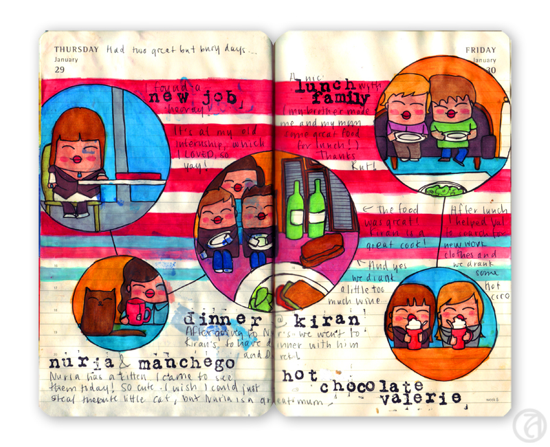
© Anna Denise Floor
It's been raining this week and Monday and Tuesday I've been mostly cooped up inside, enjoying the comforts of working from home, drinking coffee from our new machine and starving to death as obviously I wasn't going nowhere near that supermarket in this kind of weather. Ok, that's not true. Ok, it is. All I'm saying that cookies were consumed.
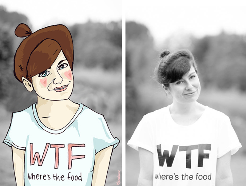
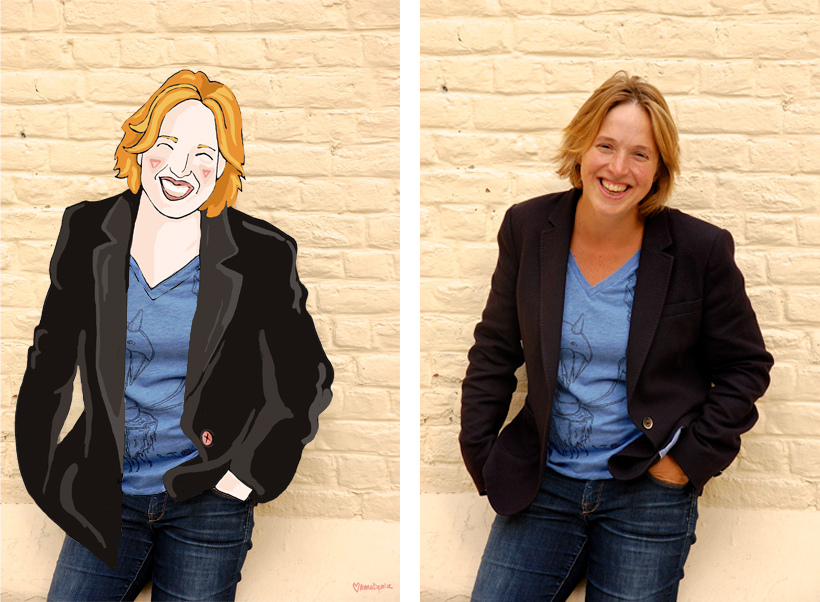
So the portrait sale is a smashing hit, of course! I've sold a whopping total of eight portraits and my financial woes are a thing of the past!
I made one of Marta, the amazingly talented lady behind 'The Luscious Joys of Princess Misia' - your one stop destination for prettyfingerlicking food photography and recipes. Where's the food, indeed. Then, two more, for VERS magazine. There's also a comic of mine that will be published in the magazine, but more about that later. And finally, I made a whole bunch for the amazing Turtlewings crew. And then I took a nap.
Anyhow. The big sale came not a minute too late, as me and my freshly earned 'doekoes', as we like to call them here, took the husband (or, the husband took me, as I still can't drive) to Friesland, where we attended a wedding, partied it up, contemplated sailing (rain, no wind, no dice), and went to see 'Borgman' instead.
Journal page for the weekend of Saturday September 7th and Sunday September 8th!
In the final part of this tutorial, I would like to talk to you about drawing and about how to put this together with all the things I’ve talked about in the previous two parts (topic, layout, colors, and materials).
I know for most of you the drawing part is the hard part. I think this is why most art journal courses you can take online focus mostly on collage, mixed media, and scrapbooking techniques (The girls over at Red Velvet Art have a pretty awesome art journal course going on right now). Now, I like that, don’t get me wrong. Like any crafty girl I love beautifully patterned papers and ribbons, but there’s something about drawing, actually illustrating my day that really works for me. I think it’s because I am a highly visual person, it feels more natural for me to draw it myself.
Now, before I actually start I would like you to consider two things:
1. I never went to art school and never took any classes, so I don’t have an advantage over you besides the fact that I’ve been drawing every day for the past four years. I think drawing is a skill you can learn by being patient with yourself and practicing.
2. Ask yourself: Who are you doing this for? Who are you keeping an illustrated journal for? I think in the end, you should be doing this for YOU. Sure, it’s loads of fun to share a pretty page you’ve made online and get nice feedback, but in the end, keeping a journal is a personal way of documenting your experiences. It will bring back memories every time you look at the page you’ve made - and for me, that’s what journaling is about.
So please give yourself permission to make mistakes and accept that things will not be perfect. You’ve probably come here because you like my drawings, but I can tell you on nearly every page of my journal I feel there’s something I could have drawn better and I'll give you an example in this installment!). We’re our own harshest critics and I think that’s just going to be what it is. Doesn’t mean it stops me from enjoying drawing or putting together my pages, or looking at those pages when they’re done. After all, it’s about documenting your experiences, not about being a professional illustrator or artist or whatever. Just have fun!
But yes, drawing is more fun with some basic steps, so here’s what I’ve learned!
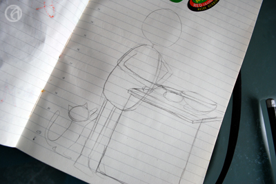
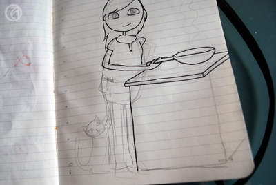
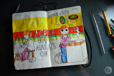
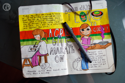
The topic... This particular day, I cooked my boyfriend a lovely dinner that I very much enjoyed making. Since this hadn't happened in a while (been too tired), I decided to draw about this. After I’ve determined the topic of my page I will think about what it was about that experience that stood out to me. 99% of the time it involves ME (since, hey, this IS my journal) and I’ll start with a sketch of a figure. I'll work in pencil first.
I sketch out the basic shape of the head first. I use some kind of egg-shaped head, but you can make it round, oval, whatever works. I then sketch out a bean-shaped form for the body. Of course this is all very anatomically incorrect, but it sure looks cute. The legs and arms are just little tubes sticking out. Depending on the subject I try to come up with a semi-realistic pose. Sometimes I check in the mirror what it looks like when I keep my hand behind my head or look at pictures. Where does the elbow bend? The wrist?
As you can see, I’m not sketching out the details yet, because I still want to be able to change things around if I feel it doesn’t work and too much detail just makes it more complicated. Getting the basic shapes right is my main priority here.
I then go on to fill in other elements in the drawing. Not too many, since I don’t like my pages to be too cluttered. What I’ve learned is that with just a few elements, you can already make a nice looking page that gets the message across. For example, in this case I could have chosen to draw the entire kitchen, but instead I chose to draw just the stove I made the food on.
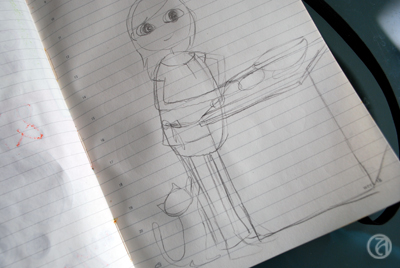
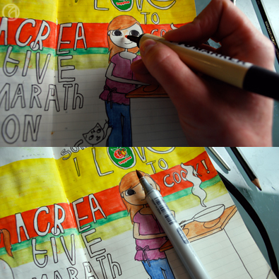
When I’m happy with my little ‘stick figure’ and the elements around the figure, I start drawing in the details. I'll start with the eyes, in this case just simple oval shapes. I try to get them to be the same in size and shape and on the same 'line'. I think this is the key to making your figure look good. Start by getting the outline right. If the eyes are not on the same level, or different in shape, just erase the one you don’t like and try again. When you’re happy with the position and the shape, you can draw in the pupil. I usually put them in the middle, because I like my figures to look at me, plus, it’s also pretty easy to draw when you’re a beginner. Even easier to draw are the closed eyes. Upward half moons usually give a happy impression, downward half moons usually give a peaceful impression (or sleepy, depending on the mouth). For the hair, be sure to place the top of the hair a bit above the skull you’ve drawn, unless you want your figure to look like she’s been standing out in the rain a tad too long.
When I'm happy with what I've drawn, I will trace the final outlines with a fineliner. Now, I'm not an expert on perspective, but I am always sure to remember to trace the lines of the elements that are in front of the other elements first. You don't even want to know how often I made that silly mistake, just because I was focusing on getting every single shape perfect.
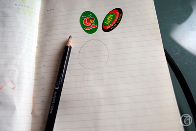
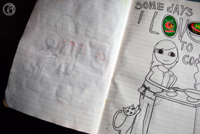
Next step is adding the text. I now do this without sketching out the letters first, but the first couple of years I always sketched them out first. And I probably still should, as I often find I misspell my titles just because I'm too focused on my lines instead of on the actual text. As you might have noticed, there were two grapefruit stickers on the page before I started drawing. I often just paste in little things like that on random pages so they'll surprise me when I get to that page and add a bit of spontaneity to the page. In this case, I used the stickers as part of the text.
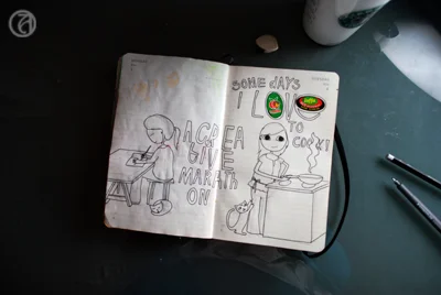
Usually I'll draw chronologically (starting on the left page first), but I was a little behind on my 'homework' and I worked on the left page after finishing the sketch on the right page.I decided at this point I would try to use the horizontal layout here, mainly because the topics are very different (the left page is about working on my art journal!).
The right page of this spread is very vertically oriented, and I attempted to compensate for this by adding the title of the page on the left more to the center of the spread. There's still not a lot of continuity between the two pages, though, so this will have to be achieve through color.
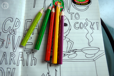
I chose the colors for this spread based on the stickers that were already there. Because I found the combination red/green/yellow a bit hard to work with, I visited the Kuler website and found a color combination I liked that includes those colors.
This one is called 'Mexican Spice' and it just stuck out to me because it's so cheerful and non-obvious. You can really see how awesome those Caran d'Ache watercolor pencils are, because I found pencils in my box that perfectly matched those of this Kuler theme!
To tie the two pages together I bit, I used one of the tricks I discussed in part one of this tutorial. I used a horizontally oriented background in the colors I just picked out . I decided not to go too wild (since the combination of the purple with the green, yellow, and red is already a little out there) and didn't use the purple in the background. Instead, I used the purple on a few items in the foreground.
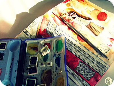
I use a small brush to wash out the colors. I love this technique and love the smoothness of the pencils. Plus, I'm too impatient to perfectly color in every color block with regular pencils, so watercolor pencils work great for me.
As you can see, the colors are a lot brighter and smoother after the first wash.
Then, I use skin colored Copics and ProMarkers for the face, and various other colors to give all the color blocks an extra layer of color. I think this makes the colors really pop.
Almost done now! When I'm completely done with the colors, I trace over ALL the outlines with fineliner again. I don't like the 'dusty' look of the lines after I've used the watercolor pencils, so I want to make them a little more sharp. This is also the time to try and correct the mistakes I've made. Like in these two pages I completely messed up the hands (of course, I didn't sketch them out properly) and I tried to make it look a little better. I'm not sure it worked, but I'm not going to feel bad about it.
Finally, I add my journalling to the page. It's usually just a short story of what the page is about, but occasionally I'll add more details about that day (if more than one interesting thing I'd like to remember happened that day).
Annnnddd... you're done! I scan in all my pages and clean up the background before uploading the scans onto Flickr. It's fun to share! However, I have had periods where I wouldn't upload any scans, mostly because I lost track of who I was creating these pages for. It's so important to realize that journalling is for YOU, because this is really where the most rewarding experience takes place.
Okay... well... I hope I've answered some of your questions about keeping an illustrated journal and drawing. Do let me know if there's something else you'd like to know! Hope you had fun!
In this second part of my mini-series on what I've learned in these past years of keeping an art journal (or illustrated journal, as I like to call it), I'll focus on what I've learned about colors and materials to use.
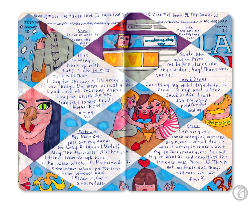
© Anna Denise Floor
As I mentioned in the first part of this tutorial, a great color scheme can really tie things together. Especially if the layout is a bit scattered, or I’m not quite sure how to tie the subject together, I’ll use a solid color scheme (or a variation of a theme) on the two facing pages.
© Anna Denise Floor
In this drawing, for example, I used the same colors on both pages, whilst keeping the subjects and the layout very separate. It really makes me like the spread better and it just feels a lot more harmonious. When I first started art journaling, I would often do this intuitively, but other times I would be horrified of how my two pretty pages looked so horrible together because of the colors I used.
So these days, before I start drawing, I try to think about what colors I want to use. What colors will play an important role in the drawing? Often, the first color is pretty obvious. On our Dutch holiday Queensday, we all dress in orange, so orange was the basis for this spread.
© Anna Denise Floor

Rocket science, really. What happens next, though, usually requires some planning on my part. I will sit in front of my pencil box and look for colors I like that will match the base color I am working with. For example, I love the combination of sea green and ochre, or (like here) orange and pink. Just putting the pencils next to each other will tell me whether I think the combination would be good for this drawing.
Now, since most of my drawings are about cheerful subjects (I don’t really see the need of focusing on the negative very often), the colors will reflect this mood. Lots of blues, pinks, oranges, and yellows. For me, those are all happy colors, but perhaps this is different for you. Red, to me, often signifies stress, so I tend to use that for drawings that are about stress. It’s not always a conscious decision on my part, but it’s nice to think about what colors mean to you personally and the implication the colors in your drawings can have on the mood of the spread.
© Anna Denise Floor
Picking a color scheme can be tricky though and after a while I notice I start to get into a pattern where I use the same color combinations over and over again. To get out of my comfort zone, I will try to find examples of other, more out of the box, color combinations. Sometimes I will look at what other artists did, look at magazines and the colors they use on one page, or I’ll check out the Kuler website for inspiration. At Kuler, you can either make your own color combinations, or just check out the gigantic database of color combinations made by other users. I really like how this can make me think differently about what colors go together.
© Anna Denise Floor
For example, for these pages, I used this Kuler color scheme. I divided the colors in the scheme over the two pages so it wouldn’t be too ‘matchy-matchy’, but made sure to put little bits of color over the two pages. For example the red text on the left matches the large red block to the left - I feel this really connects the two pages.
I know there are a lot of websites out there talking about the color wheel, color theory, etc. I took all these classes in high school and of course picked up a bit of this during my art history studies, but I think what's most important is really trying to pay attention to color combinations. Is there a favorite shirt you've got with an interesting color combination? What is it about that color combination you like? Or when you see a poster you like, look at the colors. What do the colors mean to you? You can then use these colors in your own journal pages.
As you've noticed, I use my watercolor pencils a lot. They're Caran d'Ache artist colors, supracolor soft aquarelle. Yeah, I know. Long name. I got the box when I was about ten and have used it ever since. It's a two layered box with 80 colors. Caran d'Ache is a great brand for watercolor pencils because their pencils are very soft and will blend easily. Also, they have a nice variety of color.
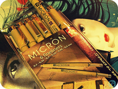
I draw in my pages after completing my sketches in Micron pens. They're really great, waterproof, archival pigment liners and come in a variety of widths. I'll talk about drawing next time, but these fine liners are a very important piece of kit to me.
I use small tip brushes to blend the watercolors, or use a box of watercolors to blend in some more color. I have a small travel box of water color paints by the label 'Van Gogh'. I like it, but think it's very basic and any high end brand will do. The watercolors will form a nice base layer for the layer that comes next.
I have a large selection of Copic markers and ProMarkers. Both of them are water-based markers I really love. Actually, Copic markers are my favorite, but they're hard to get here and ProMarkers are just that bit cheaper.
I will top off the dried watercolors with another layer of color. I like the vibrant colors and the layered look of markers on top of the watercolors. The colors just come out that more vibrant. Also, given the crappy paper of the Moleskine daily planner I use, I kind of have to. Copic markers and ProMarkers will always bleed through pretty much any kind of Moleskine and somehow the dried watercolors are greasy enough (?) that it will stop the markers from bleeding through.


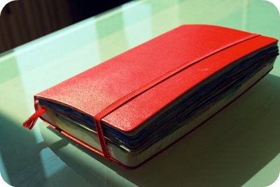
So yeah, we come to the final piece of 'kit' I use: the Moleskine. Of course many of you will be familiar with this Italian reincarnation of the famous notebook used by Van Gogh and Hemmingway. I like to use a large, daily planner, mostly because of the way the date is printed on the pages. Also, I like to keep my drawings all chronologically, in a book. It gives it an aura of importance to me. Of something big, a continuing project. But, to be honest, I usually advice people who start out to get a different notebook. The paper is just not that great, bleeds through, and the daily variety curls and gets wobbly when exposed to too much paint, watercolors, or ink. I do recommend, however, getting a nice book. For me, it's important to keep the drawings in something precious-looking. These are your stories! Treasure them!
Well, hope you enjoyed this part of the tutorial. Next time, I'll talk about drawing (and learning how to draw) and how to combine everything into one spread! Have a great Monday and please do let me know if this post was helpful to you!
Ever since I started my first journal in 2007, art journaling has been my great passion. I know that might sound silly, because art journaling is mainly about re-creating memories based on life while it’s happening. So basically, I love reflecting on life and on my days. This has always been a big part of my life (judging by the large box of journals I have), but being a highly visual person, I find that in bringing images and text together, I can get a lot closer to my true experience.
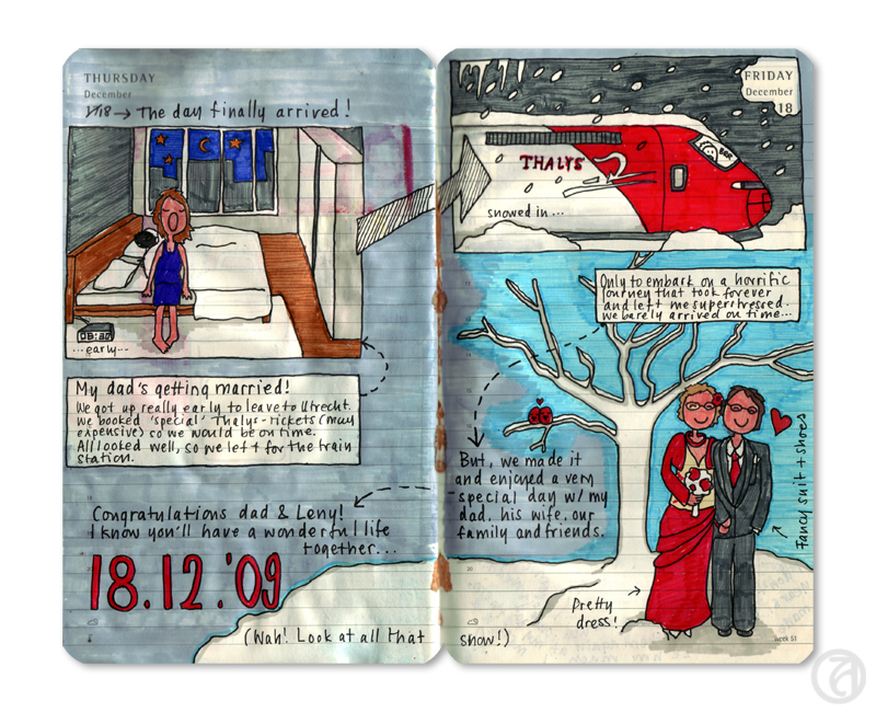
Journal page from 2010 © Anna Denise Floor
Since I am so passionate about art journaling, I often talk about my journals and about the joy they bring me. I try to really make other people see how much fun this is and how easy staring an art journal can be. Since not a small part of the fun is the Internet community around it (you!), I would like to share with you some of the things I’ve learned in the past few years about the principles of art journaling. I’ve never been to art school, so I’ve pretty much had to figure all of this out by myself, as I am assuming most of you have as well. In the coming weeks, I’ll show you what I’ve done and what I’ve learned in three parts:
Part 1 – Topics and layouts
Part 2 – Color schemes and materials
Part 3 – Drawing and putting it together
This week, for part one, I’d like to focus on the topic of the ‘spread’ (two facing pages of your journal) and layout.
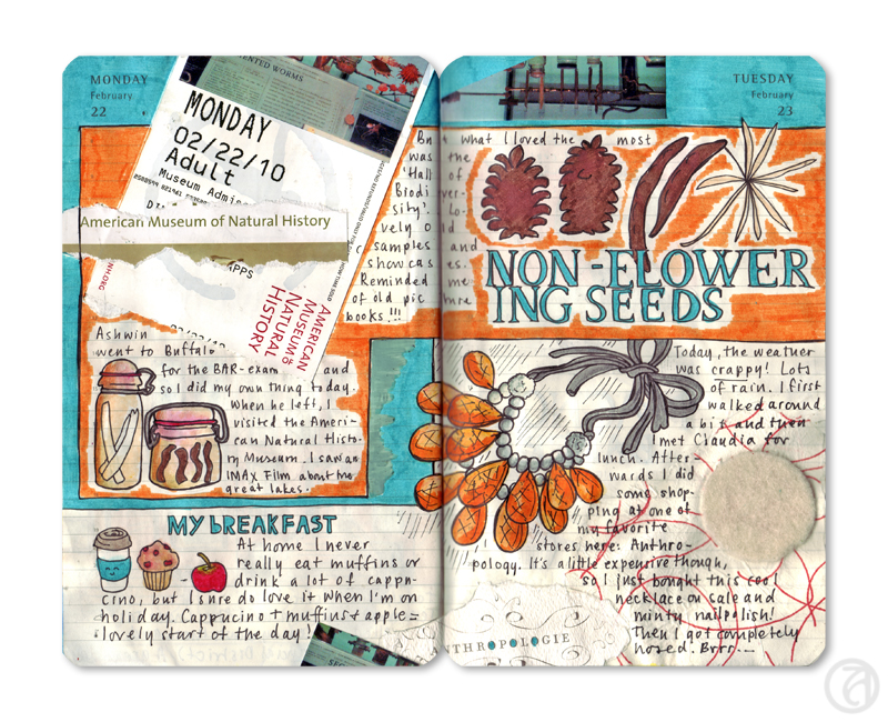
A page from 2010 © Anna Denise Floor
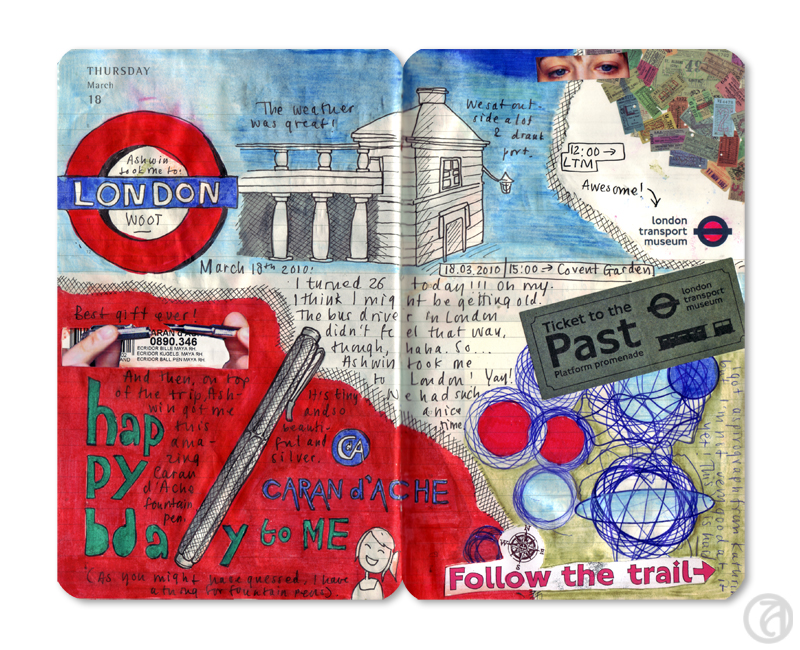
Another page from 2010 © Anna Denise Floor
Whenever I’m a little more active, during holidays or weekends, I notice I prefer to actually draw my experiences. Typically, I won’t try to draw all the things I did, but I make a selection. In making the selection I think about a) what were the highlights of my day and b) what works visually. If I have seven things I did today, but three of them involve me sitting behind my computer, I’ll try to combine some of those stories into one tale. If you like, you can quickly write down the things you absolutely want to include in your spread. It can be a nice way of keeping in mind what you want to do.
© Anna Denise Floor
Now, be aware that this structured way of working on your art journal might not be right for you. I’ve often heard teachers and very talented art journalers say that they think ‘just going with the flow and seeing where you end up’ is the way to go. I admit that perhaps this works better for when you want to put your emotions out there, but being the obsessive planner that I am, I like to work a little more structured. For me, having a couple of ‘rules’ or ‘guidelines’ actually works quite liberating, but if this makes you freeze up – please keep on doing what you’re doing. Move along. Nothing to see here. This is just how I like to work.
The layout I use the most, is the horizontal layout. It stays true to the layout of the journal and it works for me because you can give the two pages a very different topic, but at the same time, nicely tie them together. This can be done very simply by putting horizontal backgrounds in place, but also by letting the background run through. This layout works for ‘single idea’-pages as well as for ‘adventure'-pages, where you have more than one scene you're drawing.
When there’s a couple (unrelated) topics I want to deal with, I’ll often go for what I’ll call the ‘storyboard’ layout. I literally make different boxes, one box per subject.
For the ‘single-idea’-spreads, I often just use the page as being one page – centering the content in the middle of the page, or putting the focus of the drawing on one side, and the text on the other.
True to journaling, I often will do one page at a time, literally. This of course means the layout is broken up into two parts. I will often try to compensate this by using similar colors, or thinking of the kind of shapes I use in my layout. I can go for the uniform look by using the same layout on both pages, but more often, I’ll try to look for that tension. Rond shapes vs square shapes.
When I’m on vacation, I will often bring my journal with me to activities and I’ll draw a lot on the spot. This means my pages will usually be more full and a little more uncoordinated. To compensate for this, I will try to divide the pages up in sections. A section for drawing at the museum, a section for a short description or tale, a section for tickets, etc.
These are just some of the layouts I use, although I’ve probably forgotten some as well. What’s most important, I think, is that you consider the things you want to emphasize and think of how you can bring these to the attention, without breaking the harmony of the spread.