Posts tagged anna denise floor
It's a Journal, and it's All About You

"It's a journal, and it's all about you," she said, whilst handing me a plastic bag. A very personal wedding gift, with two more volumes to follow, "for when you have kids of your own". Hypothetical children Jochem and I had just promised to always take care of together, no matter what, in good times and bad. 

From the moment I was born, until age 5, my mother kept a journal of my life. What I did all day, what I ate (or refused to eat), who I played or fought with, what words I learned or made up, and all the other fascinating stuff that makes up a childhood. 
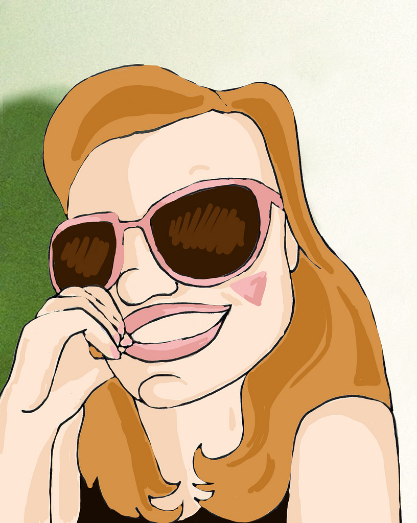
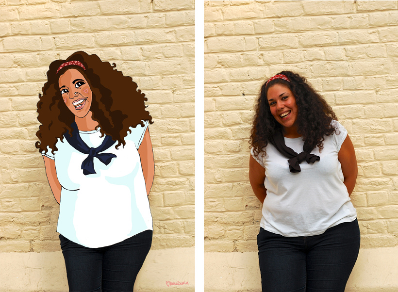
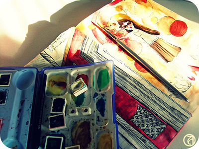
 © Anna Denise Floor

It's weird - reading about yourself. Having your mother tell you, directly, the hopes and dreams she had for you when you were three. Theories about what you would be like when you'd grow up and the things she hoped you'd learn to do or stop doing at some point (almost all wrong, hehe). But what fascinated me the most were the mundane details about our lives. About my mother's life, mostly. Picking me up from daycare, trips to the library, disagreements with friends about how to and how not to raise children, debates with my dad about what to do about my stubborn behavior (they were powerless, I tell you, powerless).
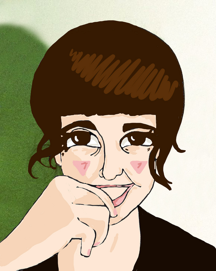
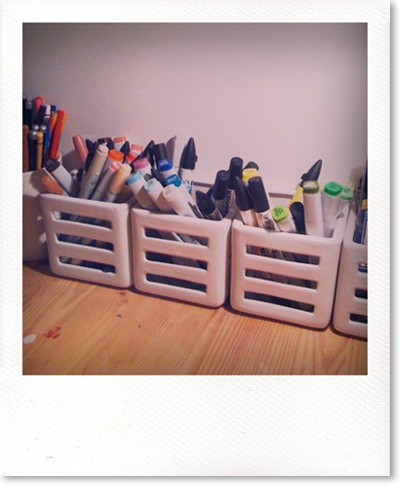
 © Anna Denise Floor

Reading her thoughts and worries made me remember that my parents were my age when they had me. I was their first and like I would be and no doubt will be, they were clueless. How do  you raise a child? I suppose everyone just stumbles along and tries their best, and I know this journal (and the two preceding it) will be a great reminder and comfort to me when I someday have children of my own. Because my parents were just trying out this and that (and then that and this), and I turned out somewhat sane. I know how to hold a job and stuff. I pay my taxes! I water my plants!  Eh. Well, mostly. Sometimes. 
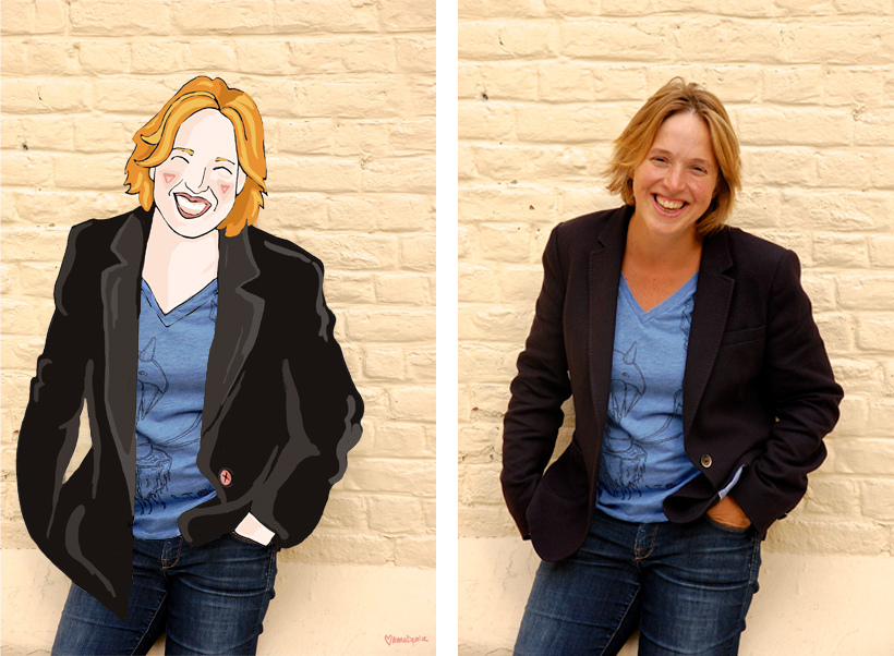
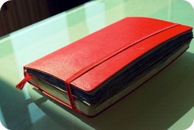
 © Anna Denise Floor

I do hope I can turn this into some kind of family tradition and do the same for my children. In the meantime I'll treasure this amazing gift, this labor of love (can you believe she did the same for my two brothers?!). Thank you, mama!

Watery Tuesday

It's been raining this week and Monday and Tuesday I've been mostly cooped up inside, enjoying the comforts of working from home, drinking coffee from our new machine and starving to death as obviously I wasn't going nowhere near that supermarket in this kind of weather. Ok, that's not true. Ok, it is. All I'm saying that cookies were consumed.

Wealth and the Weekend

So the portrait sale is a smashing hit, of course! I've sold a whopping total of eight portraits and my financial woes are a thing of the past!

I made one of Marta, the amazingly talented lady behind 'The Luscious Joys of Princess Misia' - your one stop destination for prettyfingerlicking food photography and recipes. Where's the food, indeed. Then, two more, for VERS magazine. There's also a comic of mine that will be published in the magazine, but more about that later. And finally, I made a whole bunch for the amazing Turtlewings crew. And then I took a nap. 

Anyhow. The big sale came not a minute too late, as me and my freshly earned 'doekoes', as we like to call them here, took the husband (or, the husband took me, as I still can't drive) to Friesland, where we attended a wedding, partied it up, contemplated sailing (rain, no wind, no dice), and went to see 'Borgman' instead. 

Journal page for the weekend of Saturday September 7th and Sunday September 8th!

Art Journaling 101 - Part 2: Color Schemes and Materials

In this second part of my mini-series on what I've learned in these past years of keeping an art journal (or illustrated journal, as I like to call it), I'll focus on what I've learned about colors and materials to use.

 © Anna Denise Floor

Color

As I mentioned in the first part of this tutorial, a great color scheme can really tie things together. Especially if the layout is a bit scattered, or I’m not quite sure how to tie the subject together, I’ll use a solid color scheme (or a variation of a theme) on the two facing pages. 

 © Anna Denise Floor

In this drawing, for example, I used the same colors on both pages, whilst keeping the subjects and the layout very separate. It really makes me like the spread better and it just feels a lot more harmonious. When I first started art journaling, I would often do this intuitively, but other times I would be horrified of how my two pretty pages looked so horrible together because of the colors I used. 

So these days, before I start drawing, I try to think about what colors I want to use. What colors will play an important role in the drawing? Often, the first color is pretty obvious. On our Dutch holiday Queensday, we all dress in orange, so orange was the basis for this spread. 

 © Anna Denise Floor

aj2-4.jpg

Rocket science, really. What happens next, though, usually requires some planning on my part. I will sit in front of my pencil box and look for colors I like that will match the base color I am working with. For example, I love the combination of sea green and ochre, or (like here) orange and pink. Just putting the pencils next to each other will tell me whether I think the combination would be good for this drawing. 

Now, since most of my drawings are about cheerful subjects (I don’t really see the need of focusing on the negative very often), the colors will reflect this mood. Lots of blues, pinks, oranges, and yellows. For me, those are all happy colors, but perhaps this is different for you. Red, to me, often signifies stress, so I tend to use that for drawings that are about stress. It’s not always a conscious decision on my part, but it’s nice to think about what colors mean to you personally and the implication the colors in your drawings can have on the mood of the spread.

 © Anna Denise Floor

Picking a color scheme can be tricky though and after a while I notice I start to get into a pattern where I use the same color combinations over and over again. To get out of my comfort zone, I will try to find examples of other, more out of the box, color combinations. Sometimes I will look at what other artists did, look at magazines and the colors they use on one page, or I’ll check out the Kuler website for inspiration. At Kuler, you can either make your own color combinations, or just check out the gigantic database of color combinations made by other users. I really like how this can make me think differently about what colors go together.

© Anna Denise Floor

aj2-7.jpg

For example, for these pages, I used this Kuler color scheme. I divided the colors in the scheme over the two pages so it wouldn’t be too ‘matchy-matchy’, but made sure to put little bits of color over the two pages. For example the red text on the left matches the large red block to the left - I feel this really connects the two pages.

I know there are a lot of websites out there talking about the color wheel, color theory, etc. I took all these classes in high school and of course picked up a bit of this during my art history studies, but I think what's most important is really trying to pay attention to color combinations. Is there a favorite shirt you've got with an interesting color combination? What is it about that color combination you like? Or when you see a poster you like, look at the colors. What do the colors mean to you? You can then use these colors in your own journal pages.


Materials

As you've noticed, I use my watercolor pencils a lot. They're Caran d'Ache artist colors, supracolor soft aquarelle. Yeah, I know. Long name. I got the box when I was about ten and have used it ever since. It's a two layered box with 80 colors. Caran d'Ache is a great brand for watercolor pencils because their pencils are very soft and will blend easily. Also, they have a nice variety of color. 

I draw in my pages after completing my sketches in Micron pens. They're really great, waterproof, archival pigment liners and come in a variety of widths. I'll talk about drawing next time, but these fine liners are a very important piece of kit to me.

I use small tip brushes to blend the watercolors, or use a box of watercolors to blend in some more color. I have a small travel box of water color paints by the label 'Van Gogh'. I like it, but think it's very basic and any high end brand will do. The watercolors will form a nice base layer for the layer that comes next.

I have a large selection of Copic markers and ProMarkers. Both of them are water-based markers I really love. Actually, Copic markers are my favorite, but they're hard to get here and ProMarkers are just that bit cheaper. 

I will top off the dried watercolors with another layer of color. I like the vibrant colors and the layered look of markers on top of the watercolors. The colors just come out that more vibrant. Also, given the crappy paper of the Moleskine daily planner I use, I kind of have to. Copic markers and ProMarkers will always bleed through pretty much any kind of Moleskine and somehow the dried watercolors are greasy enough (?) that it will stop the markers from bleeding through.

So yeah, we come to the final piece of 'kit' I use: the Moleskine. Of course many of you will be familiar with this Italian reincarnation of the famous notebook used by Van Gogh and Hemmingway. I like to use a large, daily planner, mostly because of the way the date is printed on the pages. Also, I like to keep my drawings all chronologically, in a book. It gives it an aura of importance to me. Of something big, a continuing project. But, to be honest, I usually advice people who start out to get a different notebook. The paper is just not that great, bleeds through, and the daily variety curls and gets wobbly when exposed to too much paint, watercolors, or ink. I do recommend, however, getting a nice book. For me, it's important to keep the drawings in something precious-looking. These are your stories! Treasure them! 

Well, hope you enjoyed this part of the tutorial. Next time, I'll talk about drawing (and learning how to draw) and how to combine everything into one spread! Have a great Monday and please do let me know if this post was helpful to you!

Art Journaling 101 - Part 1: Topics and Layouts

Ever since I started my first journal in 2007, art journaling has been my great passion. I know that might sound silly, because art journaling is mainly about re-creating memories based on life while it’s happening. So basically, I love reflecting on life and on my days. This has always been a big part of my life (judging by the large box of journals I have), but being a highly visual person, I find that in bringing images and text together, I can get a lot closer to my true experience. 

Journal page from 2010 © Anna Denise Floor

Since I am so passionate about art journaling, I often talk about my journals and about the joy they bring me. I try to really make other people see how much fun this is and how easy staring an art journal can be. Since not a small part of the fun is the Internet community around it (you!), I would like to share with you some of the things I’ve learned in the past few years about the principles of art journaling. I’ve never been to art school, so I’ve pretty much had to figure all of this out by myself, as I am assuming most of you have as well. In the coming weeks, I’ll show you what I’ve done and what I’ve learned in three parts:

Part 1 – Topics and layouts
Part 2 – Color schemes and materials
Part 3 – Drawing and putting it together

This week, for part one, I’d like to focus on the topic of the ‘spread’ (two facing pages of your journal) and layout.

A page from 2010  © Anna Denise Floor

Another page from 2010 © Anna Denise Floor

Topics

In choosing a topic for my spread I usually make a decision pretty early on. Do I want to reflect an idea, a mood, or do I want to focus on what I actually did that week? I’ve noticed I will focus on bigger ideas or moods whenever I haven’t done anything spectacular those specific days. There’s only so many ways in which I can get inspired by drawing the cycle of getting up – going to work – having dinner – going to bed. So during these kinds of weeks, I will mostly focus on some theme that played a role in my life that week, or an idea I’ve been thinking about for a while. 

Whenever I’m a little more active, during holidays or weekends, I notice I prefer to actually draw my experiences. Typically, I won’t try to draw all the things I did, but I make a selection. In making the selection I think about a) what were the highlights of my day and b) what works visually. If I have seven things I did today, but three of them involve me sitting behind my computer, I’ll try to combine some of those stories into one tale. If you like, you can quickly write down the things you absolutely want to include in your spread. It can be a nice way of keeping in mind what you want to do. 

 © Anna Denise Floor

Now, be aware that this structured way of working on your art journal might not be right for you. I’ve often heard teachers and very talented art journalers say that they think ‘just going with the flow and seeing where you end up’ is the way to go. I admit that perhaps this works better for when you want to put your emotions out there, but being the obsessive planner that I am, I like to work a little more structured. For me, having a couple of ‘rules’ or ‘guidelines’ actually works quite liberating, but if this makes you freeze up – please keep on doing what you’re doing. Move along. Nothing to see here. This is just how I like to work. 

Layouts

After looking at lot of examples online (Flickr is my favorite site to visit whenever I need a fix of inspiration, but I like looking at vintage ads as well) , I have noticed that the pages I like best are those where everything works together to get the message across. Depending on your topic, different layouts may work for you. Here are some I personally like to work with:


The 'horizontal' layout

The layout I use the most, is the horizontal layout. It stays true to the layout of the journal and it works for me because you can give the two pages a very different topic, but at the same time, nicely tie them together. This can be done very simply by putting horizontal backgrounds in place, but also by letting the background run through. This layout works for ‘single idea’-pages as well as for ‘adventure'-pages, where you have more than one scene you're drawing.


The 'storyboard' layout

When there’s a couple (unrelated) topics I want to deal with, I’ll often go for what I’ll call the ‘storyboard’ layout. I literally make different boxes, one box per subject.


The 'one page' layout

For the ‘single-idea’-spreads, I often just use the page as being one page – centering the content in the middle of the page, or putting the focus of the drawing on one side, and the text on the other.


Separate pages

True to journaling, I often will do one page at a time, literally. This of course means the layout is broken up into two parts. I will often try to compensate this by using similar colors, or thinking of the kind of shapes I use in my layout. I can go for the uniform look by using the same layout on both pages, but more often, I’ll try to look for that tension. Rond shapes vs square shapes.


Adventure pages

When I’m on vacation, I will often bring my journal with me to activities and I’ll draw a lot on the spot. This means my pages will usually be more full and a little more uncoordinated. To compensate for this, I will try to divide the pages up in sections. A section for drawing at the museum, a section for a short description or tale, a section for tickets, etc. 

These are just some of the layouts I use, although I’ve probably forgotten some as well. What’s most important, I think, is that you consider the things you want to emphasize and think of how you can bring these to the attention, without breaking the harmony of the spread.