

© Anna Denise Floor
This weekend, I went on a surprise trip to Strasbourg. and I'd like to share with you a review of an exhibition of Tomi Ungerer's work.
Tomi Ungerer is a French illustrator born in Strasbourg, who did most of his work while living in New York (I think he's back in Strasbourg now, not sure). In 2007, the Tomi Ungerer Museum in Strasbourg was opened in honor of this living legend and we decided the pay the museum a visit.
The museum is not very large, but it's an absolutely gorgeous building. Light, white, and with a fun little sculpture garden out front. The works inside were carefully displayed and the accompanying texts were concise and informative. The exhibition on display was called Tomi Ungerer, a Multifaceted Artist, and boy, what an apt title that was.
0) BOOKS, TOYS, AND THE THREE ROBBERS
The ground floor of the museum was dedicated to Ungerer's toy collection and children's books drawings. I loved that the museum showed both the inspiration behind his works, his sketchbooks and the sketches that led up to the final works and published books. I don't believe I've ever owned one of his books as a kid, but his style definitely rang a bell and reminded me of some of the books my dad grew up reading (and passing onto us). Colorful, witty, but with an edge. On this floor, we also saw a selection of tv cartoons that Ungerer made, my favorite being the 'Three Robbers'. LOVE those sound effects.

1) SHARP SATIRE, BUTTS, AND BEANS
The first floor (or second, if you're American) showed some of Ungerer's more commercial and controversial work. Among the brilliantly executed anti-Vietnam war posters and Bonduelle vegetable commercials, we also saw a series of 'erotic' jewelry he designed and a series of designs for playground buildings and public bathrooms (my favorite being a square building with a giant butt on top it).
-1) FROGS AND THE DARK SIDE
It was in the basement (where else?) that we began to understand the true meaning behind the 'multifaceted' aspect of Ungerer's work as we encountered a warning that the images we were about to see weren't suitable for a younger audience. A series of sketchbooks on SM prostitutes, another series of frogs having sex with not only each other but with objects and plants ('the joy of frogs', the series was called - it really was kind of funny) and an entire room full of mangled Barbie dolls being molested by animals and other crazy creatures. Multifaceted, yes, definitely. Personally, if I were a children's book author still alive and publishing, I would have left my molested Barbie dolls hidden in the back of that closet, but perhaps I'm being too prudish. I'm not against some good erotic art every now and then (and the frogs were hilarious), but I suppose the violence of it kind of threw me off after seeing the children's book drawings. That, or I'm clearly still not over the trauma of that one time when the neighborhood bully burnt the face off my favorite Barbie doll.
All in all though, the exhibition and museum were very inspiring! I absolutely loved Ungerer's children's books drawings, the movies, and the whole presentation. I really feel I've learned more about the artist, his inspirations, and the way he works. The museum was a pleasant space to spend some time in, also because people were hanging out everywhere with their sketchbook in hand. Even the guard upstairs was doing a little sketch whilst keeping an eye on us. If you're in Strasbourg, and you're not familiar with Ungerer's work, I'd recommend going, but yeah... keep your little ones out of the crazy Barbie-room, hehe.

I like to tell my visitors that the city of Brussels, once a settlement in the swamp (Broeksel, means ‘home in the marshes’), makes a bad first impression, but a great second and third impression. The ever-changing facade of the city houses a population as diverse as the member states of the European Union, which Brussels is currently the home of. It impresses mainly through the variety of experiences one can have in this town. The Brussels Capital Region, scarred by politics and economic ambition, is made up out of 19 municipalities; each with their own unique atmosphere.
When Irene asked me to write a report on Brussels for Bloesem, I decided quickly (aided by stormy weather, I must admit), that taking on the entirety of Brussels is too ambitious a project. Instead, I will focus in my report on my own neighborhood, Ixelles (Elsene in Dutch). It is where I moved to in the spring of 2009 and the part of Brussels I have become most familiar with. Brussels is geographically divided into a lower part and an upper part, and Ixelles is located in the upper part to the south of Brussels. This leafy neighborhood houses a large African community and is also home to a lot of expats who shop in the high-end stores on the Avenue Louise. For Bloesem, I picked a few smaller, lesser-known boutiques south of the Avenue Louise.
We’ll start all the way near Place Brugmann, where we find Graphie Sud. This concept-store by Violaine Damien has an impressive collection of clothes (by Isabel Marant, Claudie Pierlot and others), decorative objects and knick-knacks from independent designers and luxury brands alike. There’s truly something to be found for every budget.
{Graphie Sud: Rue Berkendael 195, 1050 Ixelles, +32 (0)2 344 31 92}
Walking up through the beautiful art nouveau quarter of Brussels, we reach the Rue de Page. This street that leads up to the Place du Châtelain, where each Wednesday-afternoon a crowd gathers to buy cheeses and vegetables on the cosy organic market, to end the evening with a glass of champagne or beer in (or outside of) one of the many cafes. From the Chaussée de Waterloo, we quickly come across a delightful little shop on Rue de Page 92: Little Circus. I absolutely freaking adore this shop. I literally was jumping up and down the first time I entered it. Owner Morgane Teheux has great taste in children’s clothes, furniture and accessories, but the store is a treat even if you don’t have children. Among others, she sells goodies by Cocon, Sophie Cuvelier, The Small Object, Cotton & Milk, Fine Little Day, Paumesand Piqpoq.
{Little Circus: Rue du Page 92, 1050 Ixelles and the blog}
A little further up the Rue du Page, on the corner with the Rue du Prévot, we find A La Page. This charming shop, decorated with blue tile and opulent plants, recalls simple times gone by. White porcelain, vintage linens, kitchen utensils, silverware, and ancient shoes and clothing are all beautifully laid out on display. This shop regularly updates its collection with carefully selected second hand items and is an oasis of calm and reflection full of vintage treasures for your home.
{A La Page: Rue du Prévot 2, 1050 Ixelles, +32 (0)2 537 33 04}
Le Typographe, recently relocated to the Rue Américaine 67, is simultaneously a shop, a print atelier for artists, a papeterie, and a professional printer using ancient authentic techniques. The shop offers a variety of beautifully printed cards and stationary, as well as charming office supplies, pencils and gifts. Occasionally, the atelier is opened to the public and you can see the magnificent old (letterpress) printers at work. Impressive!
{Le Typographe: Rue Américaine 67, 1050 Ixelles, +32 (0)2 345 16 76}
Finally, walking towards the busy Rue de Bailli, another well-known shopping street in Ixelles, we find theRose shop behind the church. This relatively large shop houses a collection of design goodies I like to describe as ‘things you really don’t need but really want’. During previous visits I have bought (1) porcelain container shaped like a bird, (2) Pantone color chairs, countless postcards, (1) bright blue iPhone case, and (1) red scarf. The store is organized according to color and this makes browsing the store a pleasurable experience. But perhaps that’s just me. I arrange my books by color.
{Rose: Rue de l’Aqueduc 56-58, 1050 Ixelles, +32 (0)2 534 98 08}
I hope you’ve enjoyed this little store-by-store tour of my neighborhood. I must say I’ve left out quite a bit and I could go on for hours. But hey, if you made it through the tour this far, you’ve at least seen some of the highlights. Special thanks to my friend Debbie and boyfriend Ashwin for accompanying me on my walk.
Love, Anna Denise
In the final part of this tutorial, I would like to talk to you about drawing and about how to put this together with all the things I’ve talked about in the previous two parts (topic, layout, colors, and materials).
I know for most of you the drawing part is the hard part. I think this is why most art journal courses you can take online focus mostly on collage, mixed media, and scrapbooking techniques (The girls over at Red Velvet Art have a pretty awesome art journal course going on right now). Now, I like that, don’t get me wrong. Like any crafty girl I love beautifully patterned papers and ribbons, but there’s something about drawing, actually illustrating my day that really works for me. I think it’s because I am a highly visual person, it feels more natural for me to draw it myself.
Now, before I actually start I would like you to consider two things:
1. I never went to art school and never took any classes, so I don’t have an advantage over you besides the fact that I’ve been drawing every day for the past four years. I think drawing is a skill you can learn by being patient with yourself and practicing.
2. Ask yourself: Who are you doing this for? Who are you keeping an illustrated journal for? I think in the end, you should be doing this for YOU. Sure, it’s loads of fun to share a pretty page you’ve made online and get nice feedback, but in the end, keeping a journal is a personal way of documenting your experiences. It will bring back memories every time you look at the page you’ve made - and for me, that’s what journaling is about.
So please give yourself permission to make mistakes and accept that things will not be perfect. You’ve probably come here because you like my drawings, but I can tell you on nearly every page of my journal I feel there’s something I could have drawn better and I'll give you an example in this installment!). We’re our own harshest critics and I think that’s just going to be what it is. Doesn’t mean it stops me from enjoying drawing or putting together my pages, or looking at those pages when they’re done. After all, it’s about documenting your experiences, not about being a professional illustrator or artist or whatever. Just have fun!
But yes, drawing is more fun with some basic steps, so here’s what I’ve learned!
Drawing and putting it all together
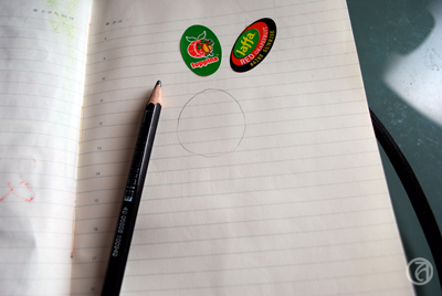


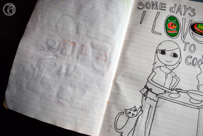


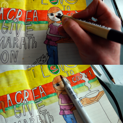
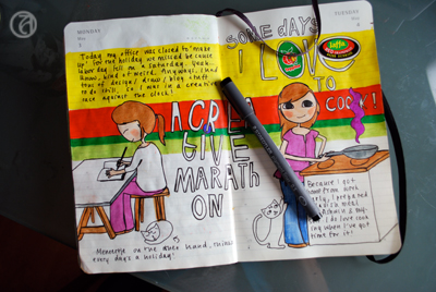
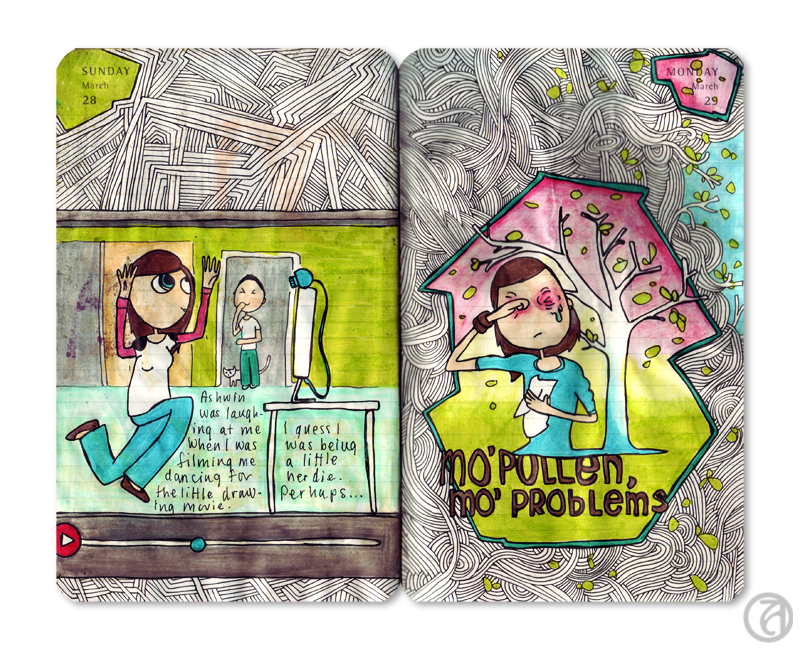
The topic... This particular day, I cooked my boyfriend a lovely dinner that I very much enjoyed making. Since this hadn't happened in a while (been too tired), I decided to draw about this. After I’ve determined the topic of my page I will think about what it was about that experience that stood out to me. 99% of the time it involves ME (since, hey, this IS my journal) and I’ll start with a sketch of a figure. I'll work in pencil first.
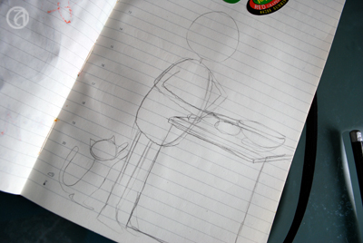
I sketch out the basic shape of the head first. I use some kind of egg-shaped head, but you can make it round, oval, whatever works. I then sketch out a bean-shaped form for the body. Of course this is all very anatomically incorrect, but it sure looks cute. The legs and arms are just little tubes sticking out. Depending on the subject I try to come up with a semi-realistic pose. Sometimes I check in the mirror what it looks like when I keep my hand behind my head or look at pictures. Where does the elbow bend? The wrist?
As you can see, I’m not sketching out the details yet, because I still want to be able to change things around if I feel it doesn’t work and too much detail just makes it more complicated. Getting the basic shapes right is my main priority here.
I then go on to fill in other elements in the drawing. Not too many, since I don’t like my pages to be too cluttered. What I’ve learned is that with just a few elements, you can already make a nice looking page that gets the message across. For example, in this case I could have chosen to draw the entire kitchen, but instead I chose to draw just the stove I made the food on.
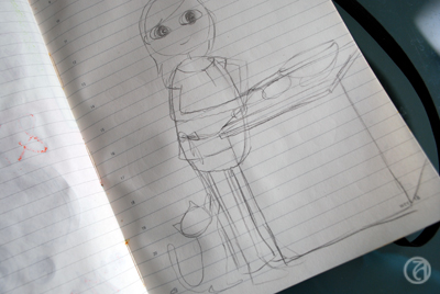
When I’m happy with my little ‘stick figure’ and the elements around the figure, I start drawing in the details. I'll start with the eyes, in this case just simple oval shapes. I try to get them to be the same in size and shape and on the same 'line'. I think this is the key to making your figure look good. Start by getting the outline right. If the eyes are not on the same level, or different in shape, just erase the one you don’t like and try again. When you’re happy with the position and the shape, you can draw in the pupil. I usually put them in the middle, because I like my figures to look at me, plus, it’s also pretty easy to draw when you’re a beginner. Even easier to draw are the closed eyes. Upward half moons usually give a happy impression, downward half moons usually give a peaceful impression (or sleepy, depending on the mouth). For the hair, be sure to place the top of the hair a bit above the skull you’ve drawn, unless you want your figure to look like she’s been standing out in the rain a tad too long.
When I'm happy with what I've drawn, I will trace the final outlines with a fineliner. Now, I'm not an expert on perspective, but I am always sure to remember to trace the lines of the elements that are in front of the other elements first. You don't even want to know how often I made that silly mistake, just because I was focusing on getting every single shape perfect.
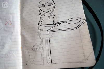
Next step is adding the text. I now do this without sketching out the letters first, but the first couple of years I always sketched them out first. And I probably still should, as I often find I misspell my titles just because I'm too focused on my lines instead of on the actual text. As you might have noticed, there were two grapefruit stickers on the page before I started drawing. I often just paste in little things like that on random pages so they'll surprise me when I get to that page and add a bit of spontaneity to the page. In this case, I used the stickers as part of the text.
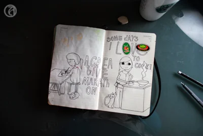
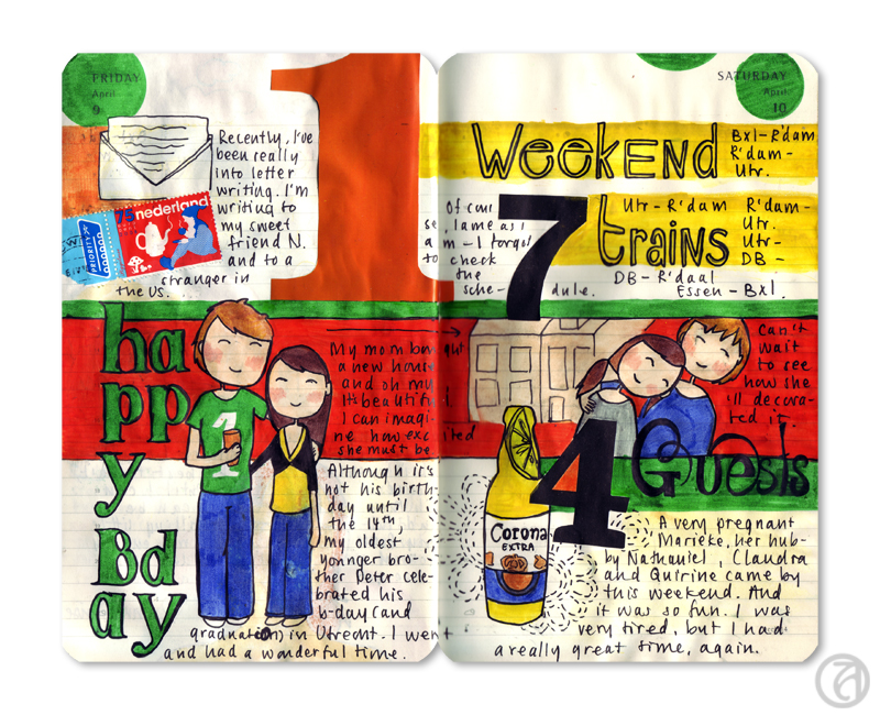
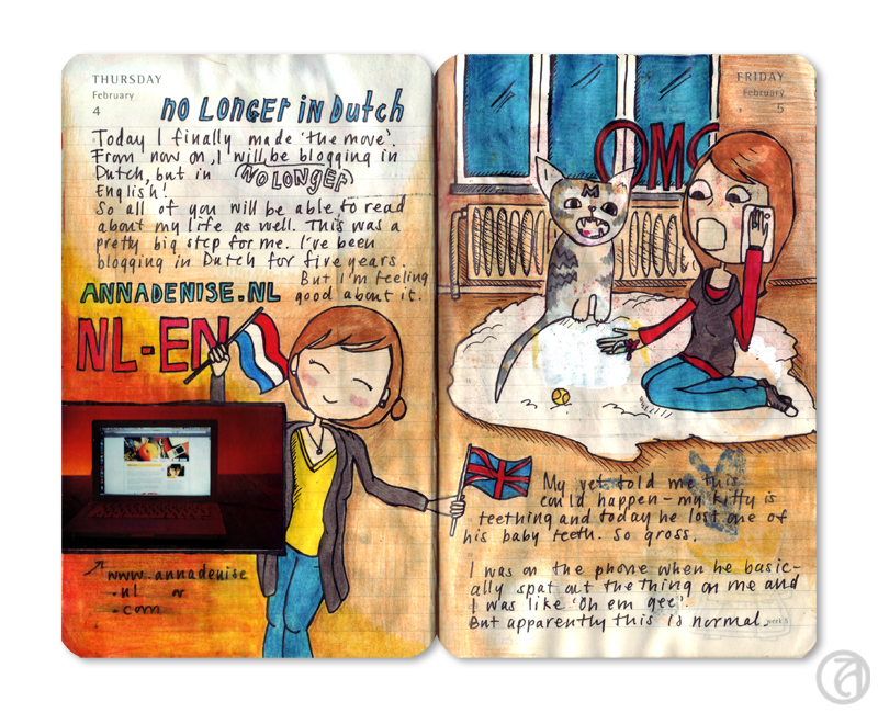
Usually I'll draw chronologically (starting on the left page first), but I was a little behind on my 'homework' and I worked on the left page after finishing the sketch on the right page.I decided at this point I would try to use the horizontal layout here, mainly because the topics are very different (the left page is about working on my art journal!).
The right page of this spread is very vertically oriented, and I attempted to compensate for this by adding the title of the page on the left more to the center of the spread. There's still not a lot of continuity between the two pages, though, so this will have to be achieve through color.
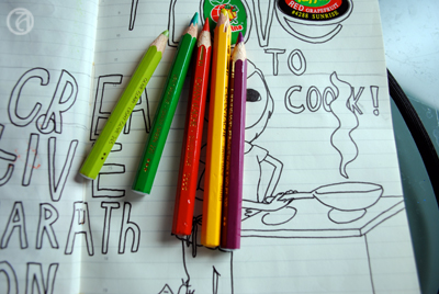
I chose the colors for this spread based on the stickers that were already there. Because I found the combination red/green/yellow a bit hard to work with, I visited the Kuler website and found a color combination I liked that includes those colors.
This one is called 'Mexican Spice' and it just stuck out to me because it's so cheerful and non-obvious. You can really see how awesome those Caran d'Ache watercolor pencils are, because I found pencils in my box that perfectly matched those of this Kuler theme!
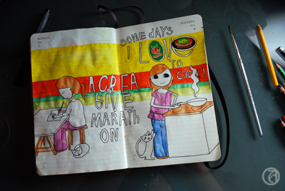
To tie the two pages together I bit, I used one of the tricks I discussed in part one of this tutorial. I used a horizontally oriented background in the colors I just picked out . I decided not to go too wild (since the combination of the purple with the green, yellow, and red is already a little out there) and didn't use the purple in the background. Instead, I used the purple on a few items in the foreground.
I use a small brush to wash out the colors. I love this technique and love the smoothness of the pencils. Plus, I'm too impatient to perfectly color in every color block with regular pencils, so watercolor pencils work great for me.
As you can see, the colors are a lot brighter and smoother after the first wash.
Then, I use skin colored Copics and ProMarkers for the face, and various other colors to give all the color blocks an extra layer of color. I think this makes the colors really pop.
Almost done now! When I'm completely done with the colors, I trace over ALL the outlines with fineliner again. I don't like the 'dusty' look of the lines after I've used the watercolor pencils, so I want to make them a little more sharp. This is also the time to try and correct the mistakes I've made. Like in these two pages I completely messed up the hands (of course, I didn't sketch them out properly) and I tried to make it look a little better. I'm not sure it worked, but I'm not going to feel bad about it.
Finally, I add my journalling to the page. It's usually just a short story of what the page is about, but occasionally I'll add more details about that day (if more than one interesting thing I'd like to remember happened that day).
Annnnddd... you're done! I scan in all my pages and clean up the background before uploading the scans onto Flickr. It's fun to share! However, I have had periods where I wouldn't upload any scans, mostly because I lost track of who I was creating these pages for. It's so important to realize that journalling is for YOU, because this is really where the most rewarding experience takes place.
Okay... well... I hope I've answered some of your questions about keeping an illustrated journal and drawing. Do let me know if there's something else you'd like to know! Hope you had fun!
In this second part of my mini-series on what I've learned in these past years of keeping an art journal (or illustrated journal, as I like to call it), I'll focus on what I've learned about colors and materials to use.
© Anna Denise Floor
Color
As I mentioned in the first part of this tutorial, a great color scheme can really tie things together. Especially if the layout is a bit scattered, or I’m not quite sure how to tie the subject together, I’ll use a solid color scheme (or a variation of a theme) on the two facing pages.
© Anna Denise Floor
In this drawing, for example, I used the same colors on both pages, whilst keeping the subjects and the layout very separate. It really makes me like the spread better and it just feels a lot more harmonious. When I first started art journaling, I would often do this intuitively, but other times I would be horrified of how my two pretty pages looked so horrible together because of the colors I used.
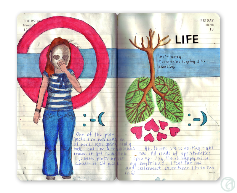
So these days, before I start drawing, I try to think about what colors I want to use. What colors will play an important role in the drawing? Often, the first color is pretty obvious. On our Dutch holiday Queensday, we all dress in orange, so orange was the basis for this spread.
© Anna Denise Floor

Rocket science, really. What happens next, though, usually requires some planning on my part. I will sit in front of my pencil box and look for colors I like that will match the base color I am working with. For example, I love the combination of sea green and ochre, or (like here) orange and pink. Just putting the pencils next to each other will tell me whether I think the combination would be good for this drawing.
Now, since most of my drawings are about cheerful subjects (I don’t really see the need of focusing on the negative very often), the colors will reflect this mood. Lots of blues, pinks, oranges, and yellows. For me, those are all happy colors, but perhaps this is different for you. Red, to me, often signifies stress, so I tend to use that for drawings that are about stress. It’s not always a conscious decision on my part, but it’s nice to think about what colors mean to you personally and the implication the colors in your drawings can have on the mood of the spread.
© Anna Denise Floor
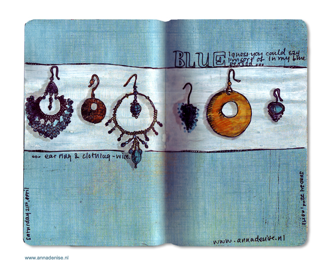
Picking a color scheme can be tricky though and after a while I notice I start to get into a pattern where I use the same color combinations over and over again. To get out of my comfort zone, I will try to find examples of other, more out of the box, color combinations. Sometimes I will look at what other artists did, look at magazines and the colors they use on one page, or I’ll check out the Kuler website for inspiration. At Kuler, you can either make your own color combinations, or just check out the gigantic database of color combinations made by other users. I really like how this can make me think differently about what colors go together.
© Anna Denise Floor
For example, for these pages, I used this Kuler color scheme. I divided the colors in the scheme over the two pages so it wouldn’t be too ‘matchy-matchy’, but made sure to put little bits of color over the two pages. For example the red text on the left matches the large red block to the left - I feel this really connects the two pages.
I know there are a lot of websites out there talking about the color wheel, color theory, etc. I took all these classes in high school and of course picked up a bit of this during my art history studies, but I think what's most important is really trying to pay attention to color combinations. Is there a favorite shirt you've got with an interesting color combination? What is it about that color combination you like? Or when you see a poster you like, look at the colors. What do the colors mean to you? You can then use these colors in your own journal pages.
Materials
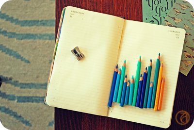
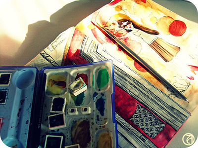
As you've noticed, I use my watercolor pencils a lot. They're Caran d'Ache artist colors, supracolor soft aquarelle. Yeah, I know. Long name. I got the box when I was about ten and have used it ever since. It's a two layered box with 80 colors. Caran d'Ache is a great brand for watercolor pencils because their pencils are very soft and will blend easily. Also, they have a nice variety of color.
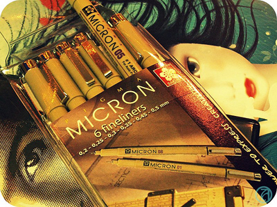
I draw in my pages after completing my sketches in Micron pens. They're really great, waterproof, archival pigment liners and come in a variety of widths. I'll talk about drawing next time, but these fine liners are a very important piece of kit to me.
I use small tip brushes to blend the watercolors, or use a box of watercolors to blend in some more color. I have a small travel box of water color paints by the label 'Van Gogh'. I like it, but think it's very basic and any high end brand will do. The watercolors will form a nice base layer for the layer that comes next.
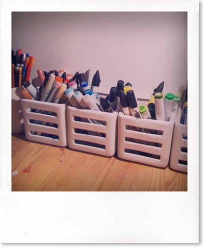
I have a large selection of Copic markers and ProMarkers. Both of them are water-based markers I really love. Actually, Copic markers are my favorite, but they're hard to get here and ProMarkers are just that bit cheaper.
I will top off the dried watercolors with another layer of color. I like the vibrant colors and the layered look of markers on top of the watercolors. The colors just come out that more vibrant. Also, given the crappy paper of the Moleskine daily planner I use, I kind of have to. Copic markers and ProMarkers will always bleed through pretty much any kind of Moleskine and somehow the dried watercolors are greasy enough (?) that it will stop the markers from bleeding through.


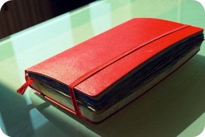
So yeah, we come to the final piece of 'kit' I use: the Moleskine. Of course many of you will be familiar with this Italian reincarnation of the famous notebook used by Van Gogh and Hemmingway. I like to use a large, daily planner, mostly because of the way the date is printed on the pages. Also, I like to keep my drawings all chronologically, in a book. It gives it an aura of importance to me. Of something big, a continuing project. But, to be honest, I usually advice people who start out to get a different notebook. The paper is just not that great, bleeds through, and the daily variety curls and gets wobbly when exposed to too much paint, watercolors, or ink. I do recommend, however, getting a nice book. For me, it's important to keep the drawings in something precious-looking. These are your stories! Treasure them!
Well, hope you enjoyed this part of the tutorial. Next time, I'll talk about drawing (and learning how to draw) and how to combine everything into one spread! Have a great Monday and please do let me know if this post was helpful to you!


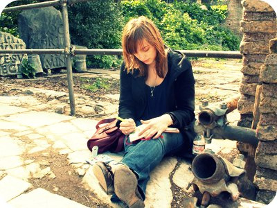
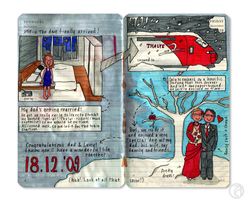
Ever since I started my first journal in 2007, art journaling has been my great passion. I know that might sound silly, because art journaling is mainly about re-creating memories based on life while it’s happening. So basically, I love reflecting on life and on my days. This has always been a big part of my life (judging by the large box of journals I have), but being a highly visual person, I find that in bringing images and text together, I can get a lot closer to my true experience.
Journal page from 2010 © Anna Denise Floor
Since I am so passionate about art journaling, I often talk about my journals and about the joy they bring me. I try to really make other people see how much fun this is and how easy staring an art journal can be. Since not a small part of the fun is the Internet community around it (you!), I would like to share with you some of the things I’ve learned in the past few years about the principles of art journaling. I’ve never been to art school, so I’ve pretty much had to figure all of this out by myself, as I am assuming most of you have as well. In the coming weeks, I’ll show you what I’ve done and what I’ve learned in three parts:
Part 1 – Topics and layouts
Part 2 – Color schemes and materials
Part 3 – Drawing and putting it together
This week, for part one, I’d like to focus on the topic of the ‘spread’ (two facing pages of your journal) and layout.
A page from 2010 © Anna Denise Floor
Another page from 2010 © Anna Denise Floor
Topics
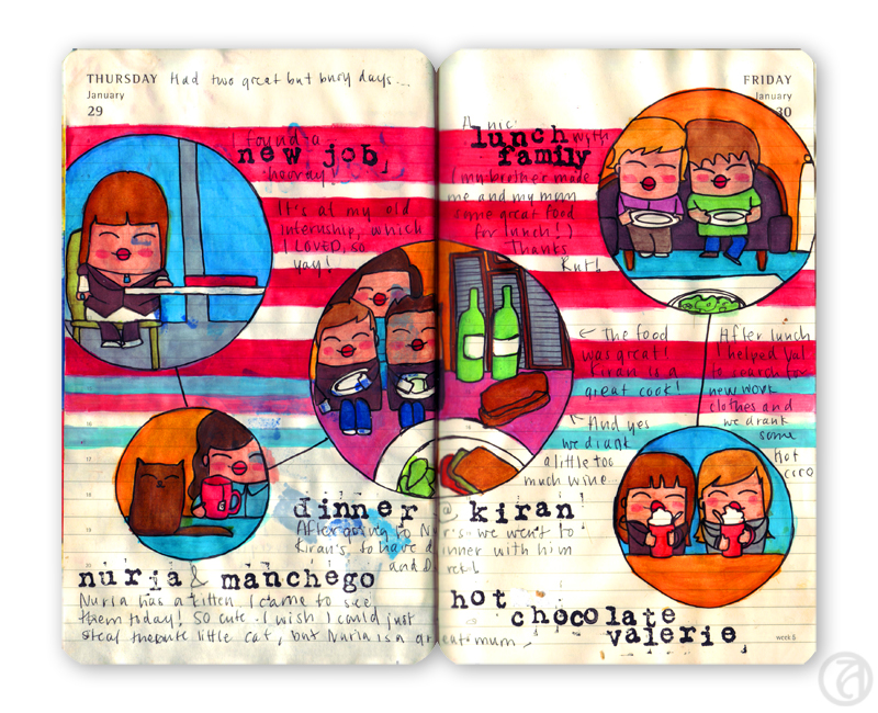
In choosing a topic for my spread I usually make a decision pretty early on. Do I want to reflect an idea, a mood, or do I want to focus on what I actually did that week? I’ve noticed I will focus on bigger ideas or moods whenever I haven’t done anything spectacular those specific days. There’s only so many ways in which I can get inspired by drawing the cycle of getting up – going to work – having dinner – going to bed. So during these kinds of weeks, I will mostly focus on some theme that played a role in my life that week, or an idea I’ve been thinking about for a while.Whenever I’m a little more active, during holidays or weekends, I notice I prefer to actually draw my experiences. Typically, I won’t try to draw all the things I did, but I make a selection. In making the selection I think about a) what were the highlights of my day and b) what works visually. If I have seven things I did today, but three of them involve me sitting behind my computer, I’ll try to combine some of those stories into one tale. If you like, you can quickly write down the things you absolutely want to include in your spread. It can be a nice way of keeping in mind what you want to do.
© Anna Denise Floor
Now, be aware that this structured way of working on your art journal might not be right for you. I’ve often heard teachers and very talented art journalers say that they think ‘just going with the flow and seeing where you end up’ is the way to go. I admit that perhaps this works better for when you want to put your emotions out there, but being the obsessive planner that I am, I like to work a little more structured. For me, having a couple of ‘rules’ or ‘guidelines’ actually works quite liberating, but if this makes you freeze up – please keep on doing what you’re doing. Move along. Nothing to see here. This is just how I like to work.
Layouts
After looking at lot of examples online (Flickr is my favorite site to visit whenever I need a fix of inspiration, but I like looking at vintage ads as well) , I have noticed that the pages I like best are those where everything works together to get the message across. Depending on your topic, different layouts may work for you. Here are some I personally like to work with:
The 'horizontal' layout

The layout I use the most, is the horizontal layout. It stays true to the layout of the journal and it works for me because you can give the two pages a very different topic, but at the same time, nicely tie them together. This can be done very simply by putting horizontal backgrounds in place, but also by letting the background run through. This layout works for ‘single idea’-pages as well as for ‘adventure'-pages, where you have more than one scene you're drawing.
The 'storyboard' layout
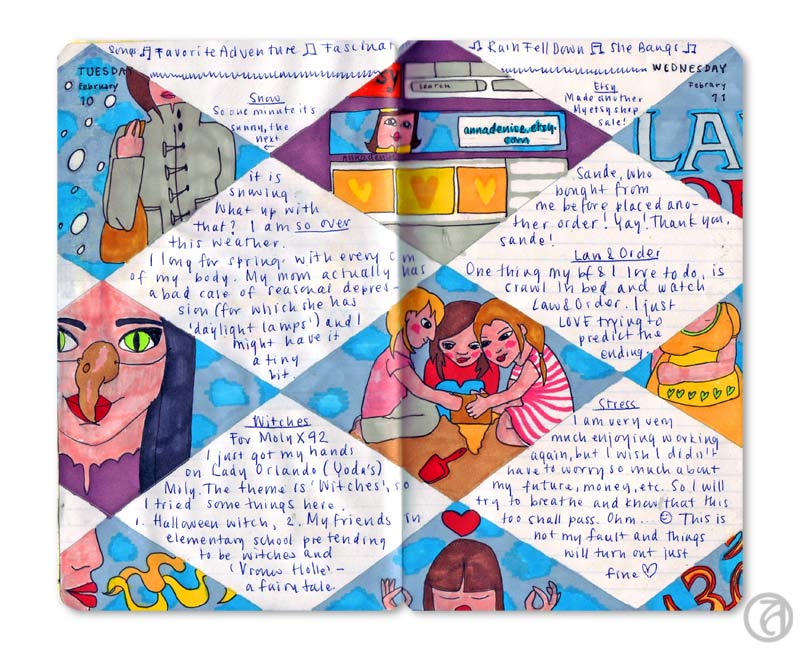
When there’s a couple (unrelated) topics I want to deal with, I’ll often go for what I’ll call the ‘storyboard’ layout. I literally make different boxes, one box per subject.
The 'one page' layout
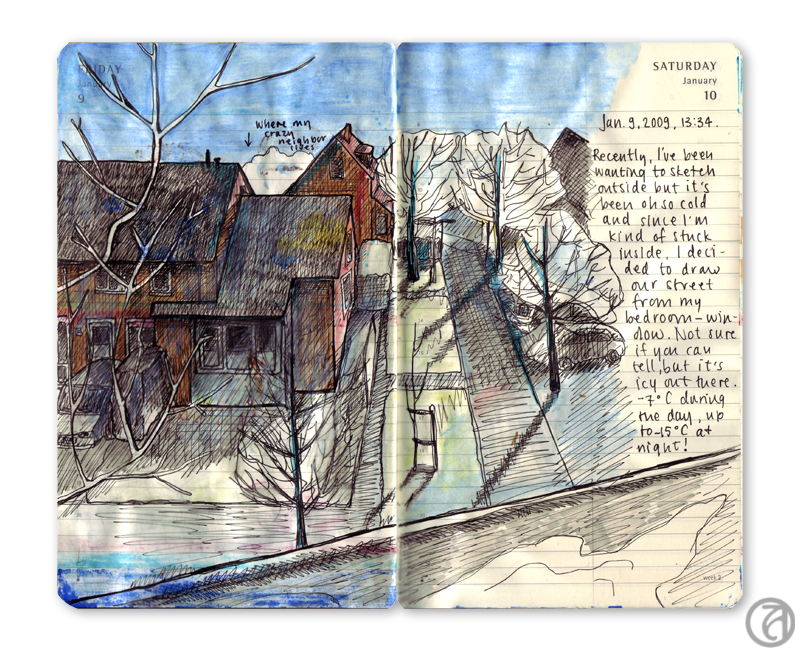
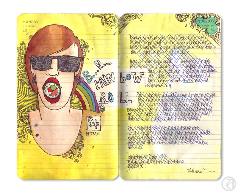
For the ‘single-idea’-spreads, I often just use the page as being one page – centering the content in the middle of the page, or putting the focus of the drawing on one side, and the text on the other.
Separate pages
True to journaling, I often will do one page at a time, literally. This of course means the layout is broken up into two parts. I will often try to compensate this by using similar colors, or thinking of the kind of shapes I use in my layout. I can go for the uniform look by using the same layout on both pages, but more often, I’ll try to look for that tension. Rond shapes vs square shapes.
Adventure pages

When I’m on vacation, I will often bring my journal with me to activities and I’ll draw a lot on the spot. This means my pages will usually be more full and a little more uncoordinated. To compensate for this, I will try to divide the pages up in sections. A section for drawing at the museum, a section for a short description or tale, a section for tickets, etc.
These are just some of the layouts I use, although I’ve probably forgotten some as well. What’s most important, I think, is that you consider the things you want to emphasize and think of how you can bring these to the attention, without breaking the harmony of the spread.